Brown University Health
A new digital experience for the Rhode Island community to support the blending of Brown University and the Lifespan Network of hospitals.
THE CLIENT
Brown University Health
Redesign the external marketing website, and the internal intranet website for the Brown Health University network of hospitals to match the newly established brand and joining of Brown University and Lifespan Health Network.
PROJECT OVERVIEW
TASKS INVOLVED
This was a UX, UI, and digital brand expansion implementation project. The initial process included expanding the brand color palette and fonts to meet the needs of the digital landscape, and secondly, applying those styles to a fresh, new website experience that spanned multiple templates with content block flexibility for team administrators. The goal of the new website was to stand out in a saturated field of health-based websites, and offer a modern, clean, engaging digital experience that promotes the new Brown University Health brand.
Thinking of every detail, every color, and it’s contrast ratio, to curate a new digital color palette for the website and beyond.
Redefining a Brand with Purpose
Color palette exploration that finds the perfect balance of contrast, color and balance stemming from the primary brand color, Emerald. The challenge being that the Emerald is a not an accessible color when used in the foreground and background, so it’s used as an accent in the new design.
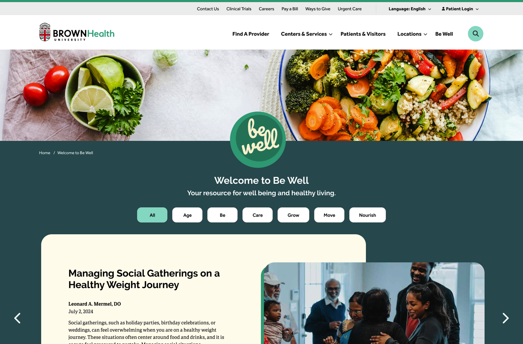
Branding the Blog–Be Well
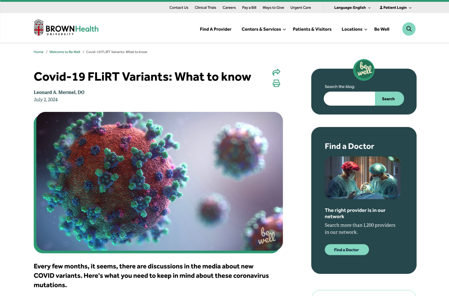
The project also included branding their popular blog, with the new name, Be Well, with the goal of differentiating the blog from the rest of the site content. The final direction features a new brand logo I.D., the blog articles on darker backgrounds, using highlights of the primary brand color as an accent, and watermarking all blog images with the Be Well logo mark.


